New York Fashion Week
New York Fashion Week: Pantone Announces Fashion Color Report Spring 2014
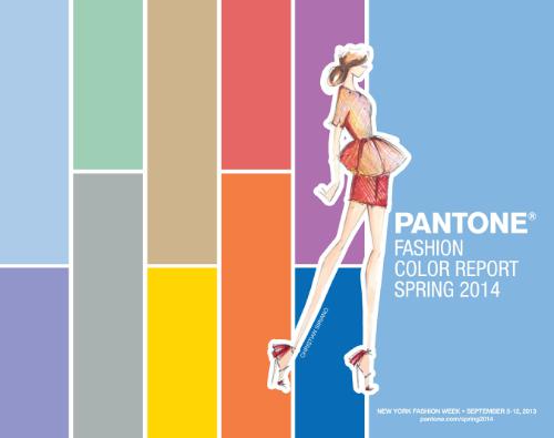
Wondering what colors are hot for Spring? Well, just in time for New York Fashion Week, Pantone has put together a report on what colors you can expect to see on the racks next Spring. the PANTONE Fashion Color Report features the top 10 colors for women’s and men’s fashion for spring 2014, along with designer sketches, quotes and headshots. The report is available for free download. Wondering what the 10 colors for Spring 2014 will be? Read on and The Recessionista will tell it all! Hey we read the report to save you some time.
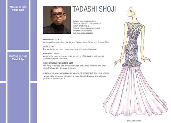
Tadashi Shoji’s scalloped lace dress in Violet Tulip for Spring 2014
The top colors for women’s fashion for spring 2014 are:
PANTONE 15-3920 Placid Blue
PANTONE 16-3823 Violet Tulip
PANTONE 15-6114 Hemlock
PANTONE 16-0000 Paloma
PANTONE 15-1225 Sand
PANTONE 14-0852 Freesia
PANTONE 18-1651 Cayenne
PANTONE 17-1360 Celosia Orange
PANTONE 18-3224 Radiant Orchid
PANTONE 18-3949 Dazzling Blue
It is expected that Designers will take a modern twist on the traditional for spring 2014 by pairing soft pastels (Tadashi Shoji SS 2014) with vivid brights (Desigual SS 2014) to create a colorful equilibrium. Inspired by a mixture of blooming flowers, travels abroad, and strong, confident women, designers will use color to refresh, revive and defy conventional wisdom.
Three very adaptable pastels sit on one end of the palette, and, because we are so accustomed to seeing them as nature’s background, they can be creatively combined with any other color in the spectrum.Placid Blue, like a picture-perfect, tranquil and reassuring sky, induces a sense of peaceful calmness, while Violet Tulip , a romantic, vintage purple, evokes wistful nostalgia. Similar to the verdant shade of springtime foliage, Hemlock, a summery, ornamental green, provides a decorative touch that’s very different from the greens of recent seasons. Pair any of these versatile pastels with a bolder hue for an au courant look.
Sand, a lightly toasted and amiable neutral, conjures images of the beach and the carefree days of summer. Try pairing Sand with Hemlock for perfect, natural balance. Paloma serves as a quintessential neutral, interesting enough to be worn alone or combined with any color for sophisticated poise.
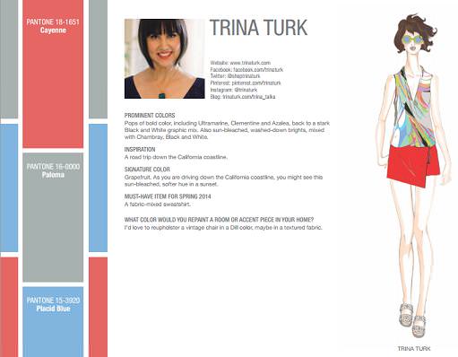
Trina Turk like Cayenne, Placid Blue and Paloma colors for Spring 2014.
Cayenne, a high-pitched red, adds a dash of spicy heat to neutrals, and heightens the excitement when mixed with Freesia, a blazing yellow that is sure to illuminate wardrobes this season. A tropical, floral-inspired shade, Freesia’s warmth and energy help set the stage for Celosia Orange, an optimistic, spontaneous hue. Pair Celosia Orange with Violet Tulip for a captivating vision, much like the setting summer sun.
The palette is brought full circle with Radiant Orchid, a bold counterpart to Violet Tulip, and Dazzling Blue, a scintillating, polar opposite to Placid Blue. Surprisingly, these strong, vibrant colors also pair well across the palette: They are perfect companions to pastels, and add confidence and vivacity when mixed with other bold colors.
The top colors for men’s fashion for spring 2014 are:
PANTONE 15-3920 Placid Blue
PANTONE 18-3718 Purple Haze
PANTONE 18-6216 Comfrey
PANTONE 16-0000 Paloma
PANTONE 15-1225 Sand
PANTONE 14-0852 Freesia
PANTONE 18-1651 Cayenne
PANTONE 17-1360 Celosia Orange
PANTONE 19-2428 Magenta Purple
PANTONE 18-3949 Dazzling Blue
Light and airy Placid Blue is a perfect background color for spring, offering another alternative to the classic neutrals. Pair it with Comfrey, a more masculine take on the softer Hemlock green from the women’s palette, to create a fresh, seasonally inspired look. For a modernized vintage feel, pair Purple Haze, a deeper, stronger version of Violet Tulip, with Paloma, a confident and adaptable gray.
Sand, a warm, agreeable neutral, can be coupled with more daring colors in the palette – making them less intimidating. Both Paloma and Sand are perfect complements to fiery Cayenne red, and help harness the powerful energy that intense Freesia yellow brings to the spectrum. Accessories, including shoes, in bold colors, like Cayenne, Freesia and Celosia Orange, are becoming more popular for men this season, adding a touch of gusto to neutral formal attire.
As the temperatures rise, we are also seeing a lot of vibrant patterning that combines bold and tropical colors in many sectors of menswear. Create a magnetic look by mixing Magenta Purple, a more robust version of Radiant Orchid, with the higher voltage colors in the palette, like Celosia Orange and Dazzling Blue. These three energetic yet versatile hues are sure to be a hit in spring 2014.
Where do these fabulous colors come from? The colors featured in the PANTONE Fashion Color Report are culled from the PANTONE FASHION + HOME Color System (remember the color wheel from school? ), the most widely used and recognized color standards system in the world. Each season, Pantone surveys the designers of New York Fashion Week and beyond to collect feedback on prominent collection colors, color inspiration and color philosophy. This information is used to create the PANTONE Fashion Color Report, which serves as a reference tool throughout the year for fashion enthusiasts, reporters and retailers. So there you have it readers! You don’t have to wait for Spring to get a reading on what the haute/hot colors will be, just get the Pantone Color Report.


0 comments